Branding & Identity
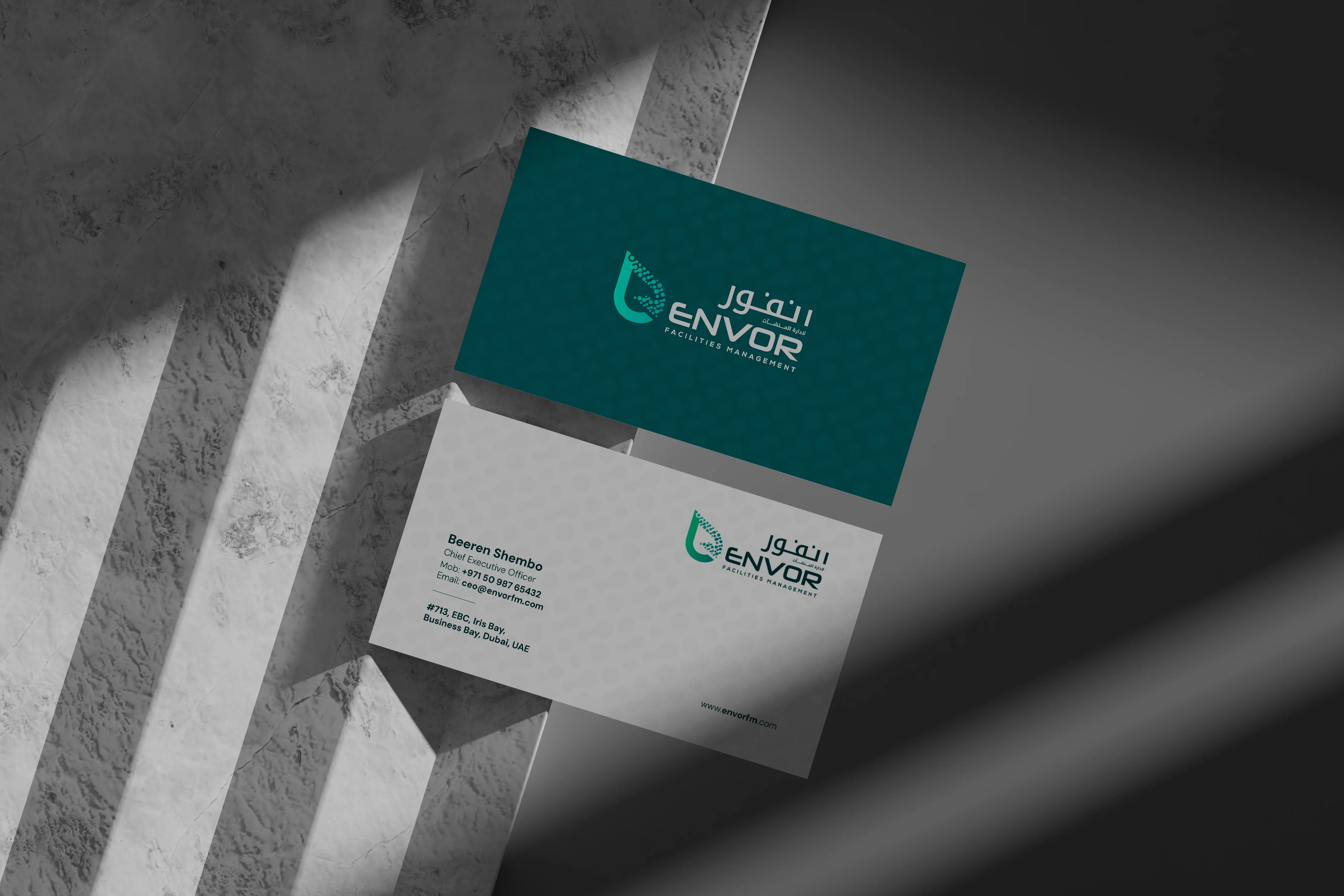
Envor Facilities Management is a UAE-based provider of total facilities management, established in 2024 to deliver professional, sustainable solutions across Residential, Commercial, Retail, Education, and Healthcare spaces. Its identity reflects the brand’s care for the places people live and work: a leaf-shaped mark paired with a clean, bilingual wordmark, built to feel trustworthy and modern in every setting.
Client:
Envor Facilities Management LLC
Scope:
Branding & Identity
Industry:
Facilities Management
Timeline:
6 Weeks
Designing the identity for Envor meant giving a new company the presence of an established one. Founded in 2024, Envor set out to raise the standard for facilities management in the UAE, with a mission built on reliability, sustainability, and seamless day-to-day operations. We began by studying that mission at its core: spaces that run smoothly, serve people well, and leave a lighter footprint. Every design decision needed to reflect the same care Envor brings to the buildings it looks after.
As the concept evolved, we focused on turning those values into a single, memorable symbol. The result is a mark that blends nature and structure, with an organic leaf form refined by clean, modern geometry. Paired with a confident bilingual wordmark in English and Arabic, the identity speaks naturally to the UAE market, giving the brand a professional, approachable presence on everything from business cards to building signage.
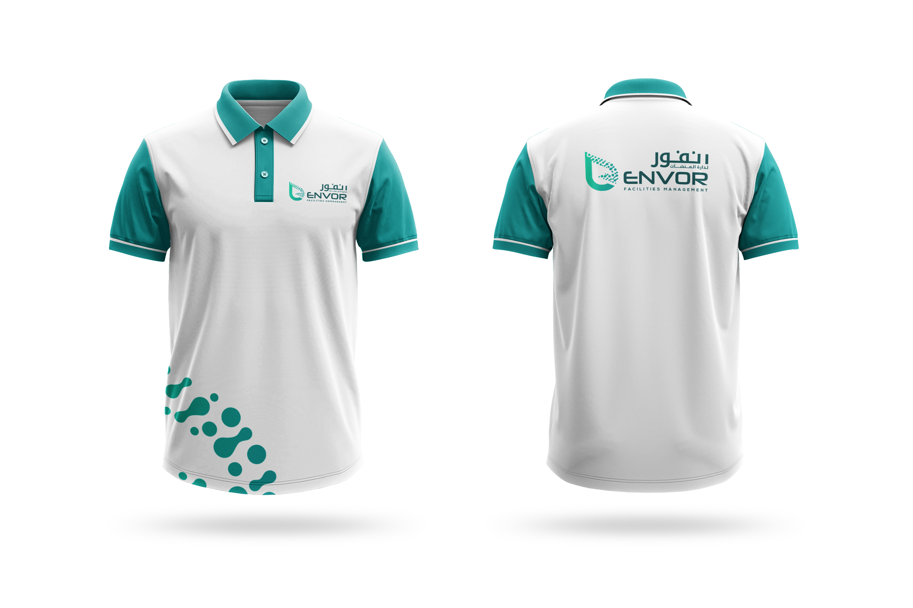
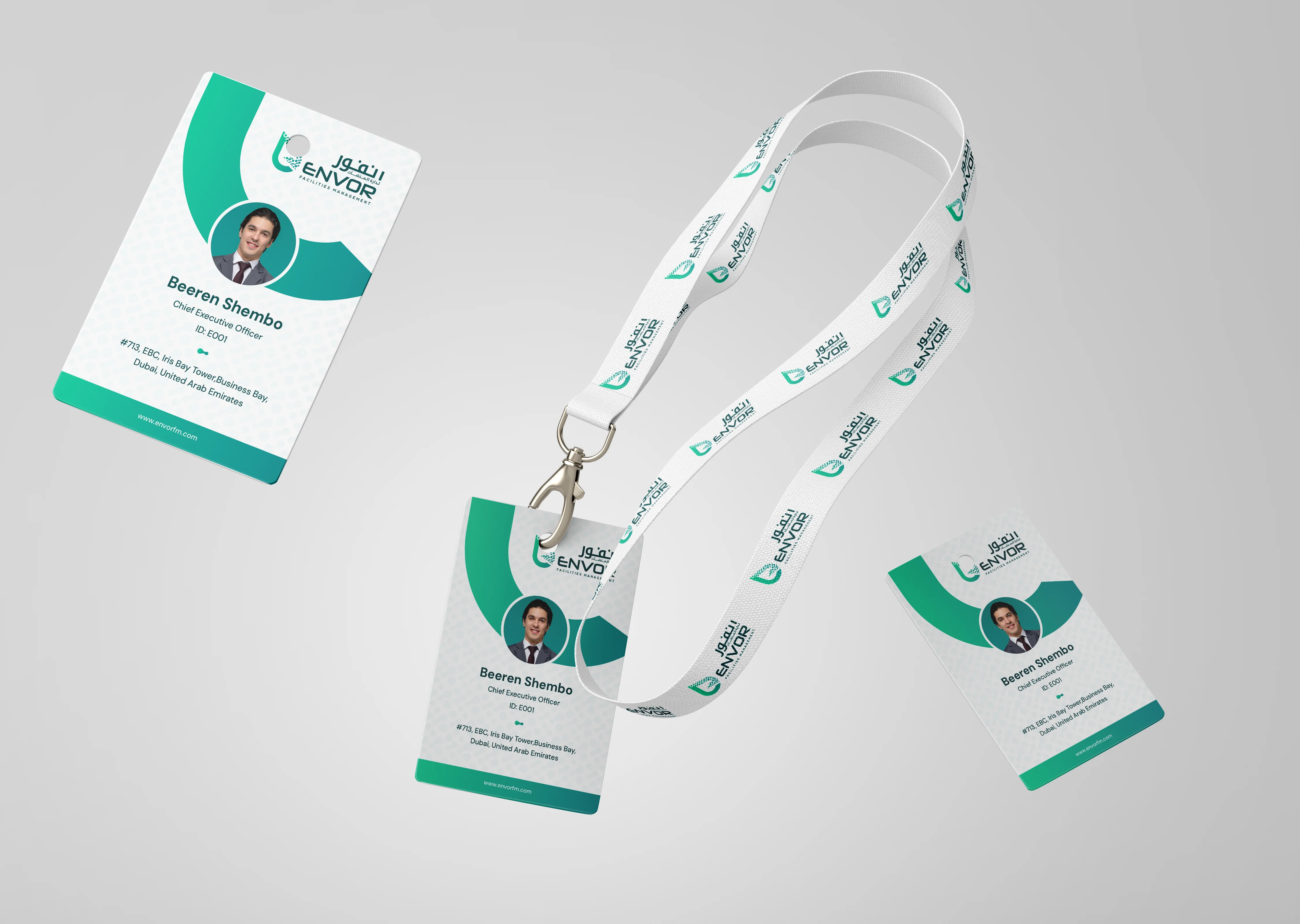
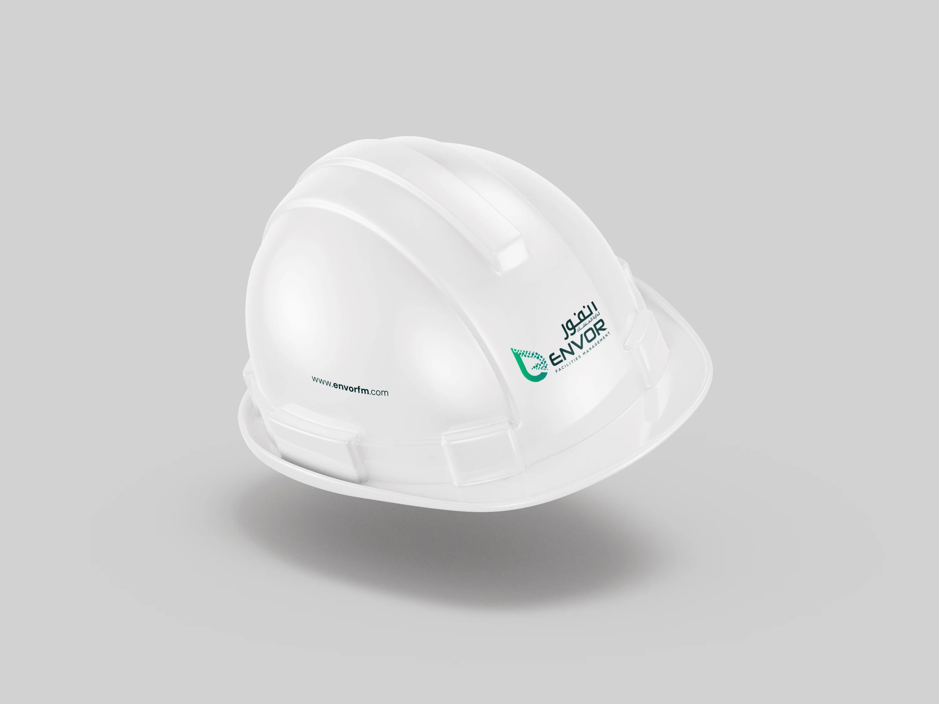
The Envor logo is built around a simple idea: sustainability, connected. The letter “e” is shaped like a leaf, a direct expression of the company’s dedication to sustainable, responsible solutions. Within it, the filled infinity shapes signify unity and interconnectedness, reflecting how Envor brings every service, sector, and team together into one seamless operation.
The supporting design choices carry the same sense of calm confidence. The bilingual wordmark is clear and well-spaced, so the brand reads equally well in English and Arabic. The deep teal and green palette reflects growth, freshness, and trust, while a subtle dotted pattern adds texture and depth across stationery and collateral. Together, the mark and wordmark form an identity that feels harmonious rather than heavy, professional, sustainable, and ready for a long-term future.

The Branhaus Experience
"Branhaus truly understands branding. They listened to our vision and turned it into something even better than we imagined."

"Branhaus helped us re define our brand of TNM Online Solutions! Highly recommended for corporate branding."

"Exceptional creativity backed by a professional approach. Branhaus helped us build a brand identity we're proud to represent."
"What we appreciate most about Branhaus is their commitment to getting every detail right. They consistently deliver thoughtful, high-quality work with a level of professionalism that's hard to find."