Branding & Identity
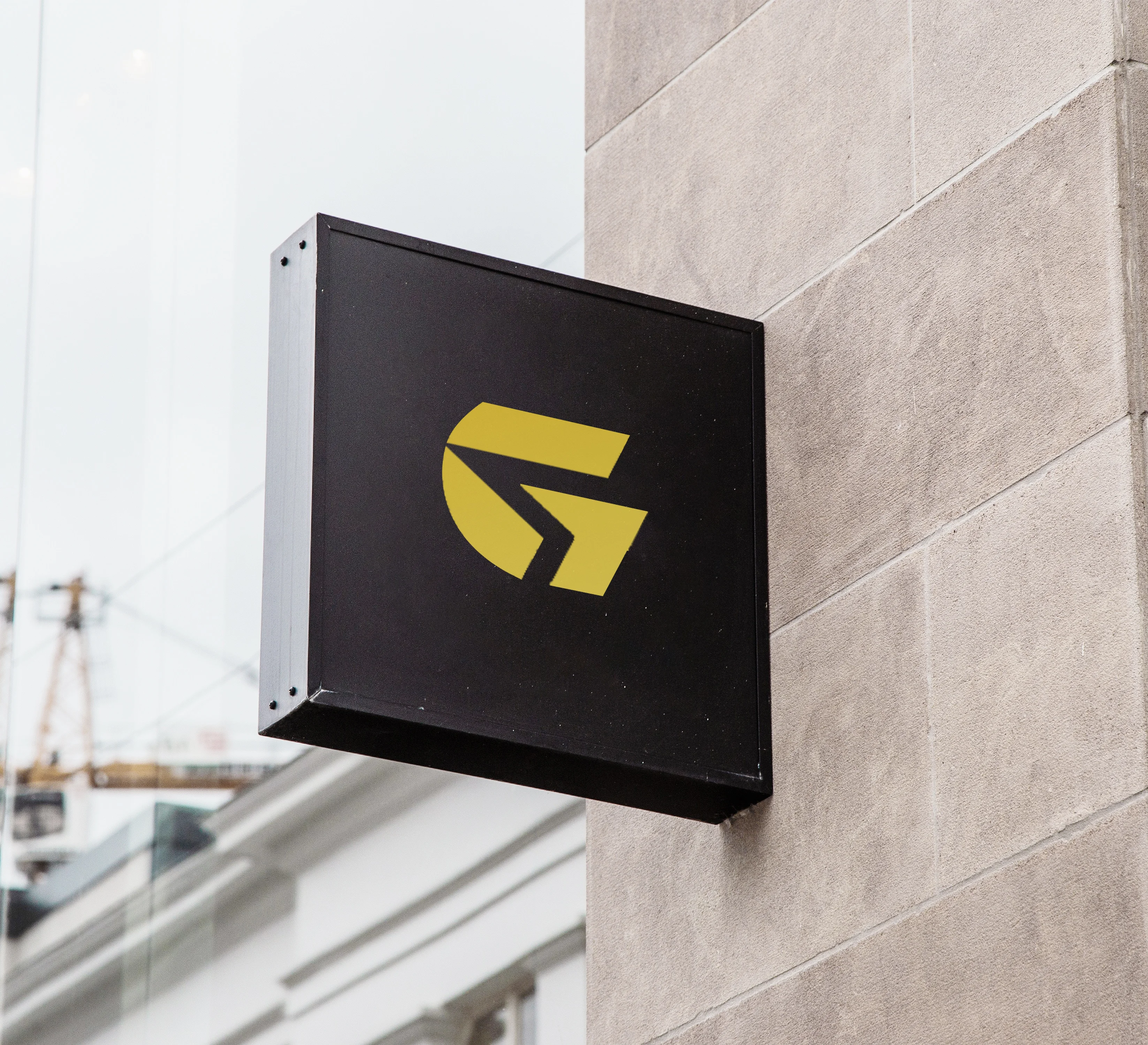
Golden Smart Gate Documents Clearing Services LLC is a newly launched Dubai company offering document clearing and business setup services, helping new businesses start their UAE journey with speed and confidence. Its identity reflects that role as a trusted guide: a sleek “G” combined with a forward arrow, paired with a bold wordmark in a premium gold and black palette.
Client:
Golden Smart Gate Documents Clearing Services LLC
Scope:
Branding & Identity
Industry:
Document Clearing / Business Setup Services
Timeline:
3 Weeks
Designing the identity for Golden Smart Gate meant giving a new company the credibility of an established one. Setting up a business in the UAE can feel complicated, and the company’s mission is to make that process clear, efficient, and stress-free. We began by studying that mission at its core: guiding new businesses through each step of setup with speed, accuracy, and confidence. Every design decision needed to reflect the same reliability the company promises its clients.
As the concept evolved, we focused on translating progress and direction into a single visual form. The result is a mark that merges a strong letter “G” with a forward-pointing arrow, suggesting movement, momentum, and a clear path ahead. Paired with a bold, modern wordmark, the identity communicates trust without complexity. It gives the brand a polished, professional presence across everything from business cards and documents to signage and digital platforms.
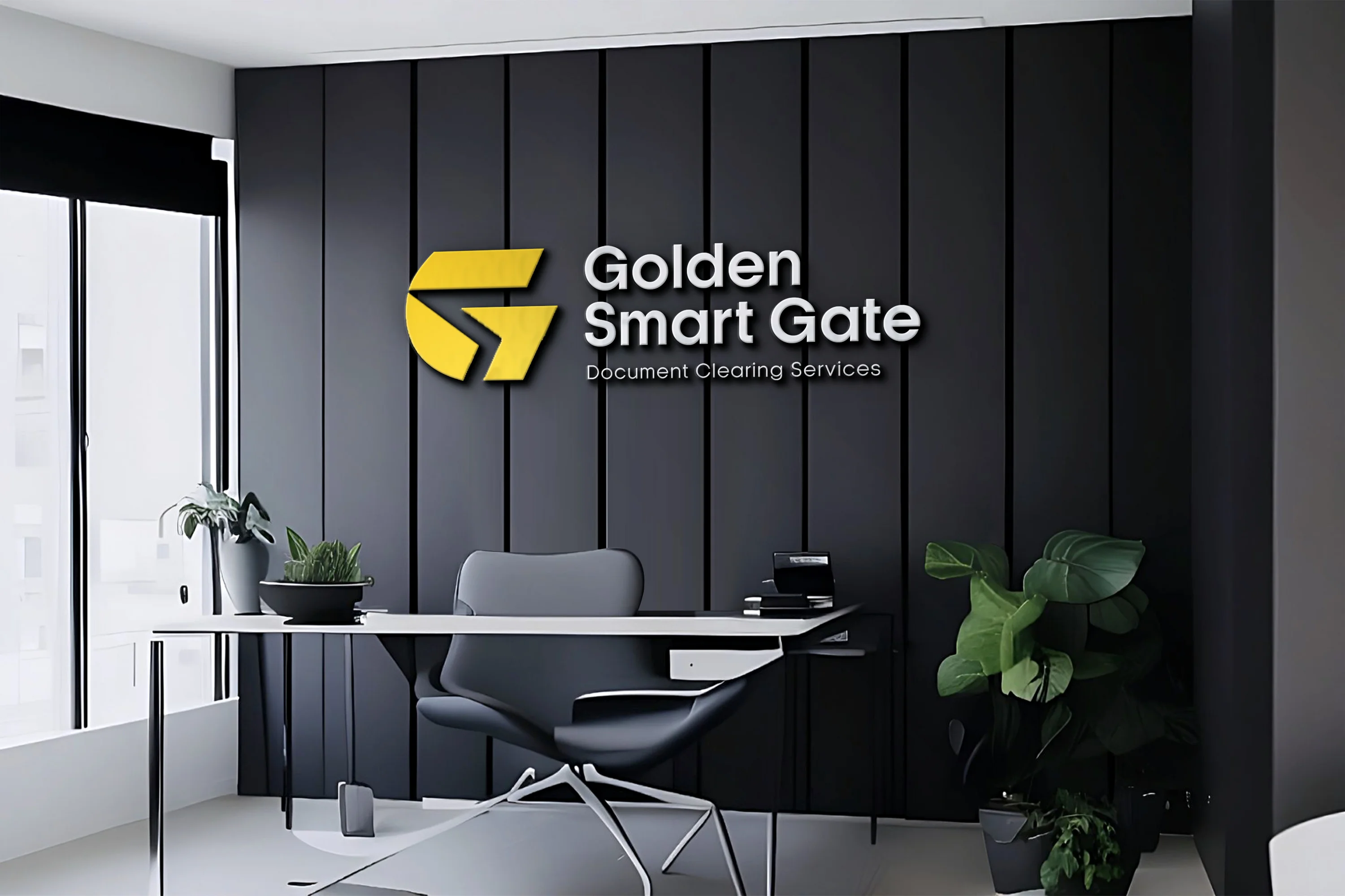
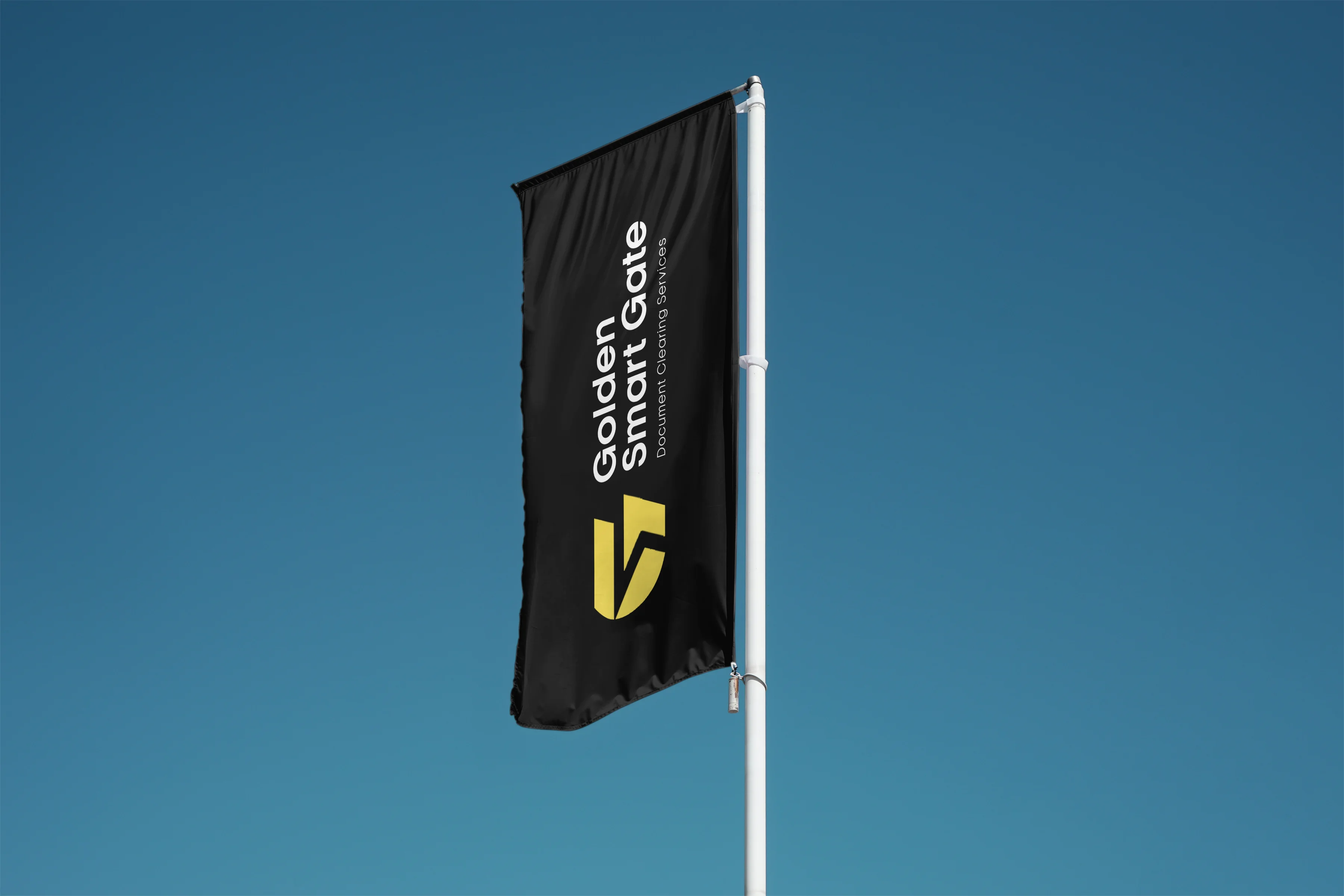
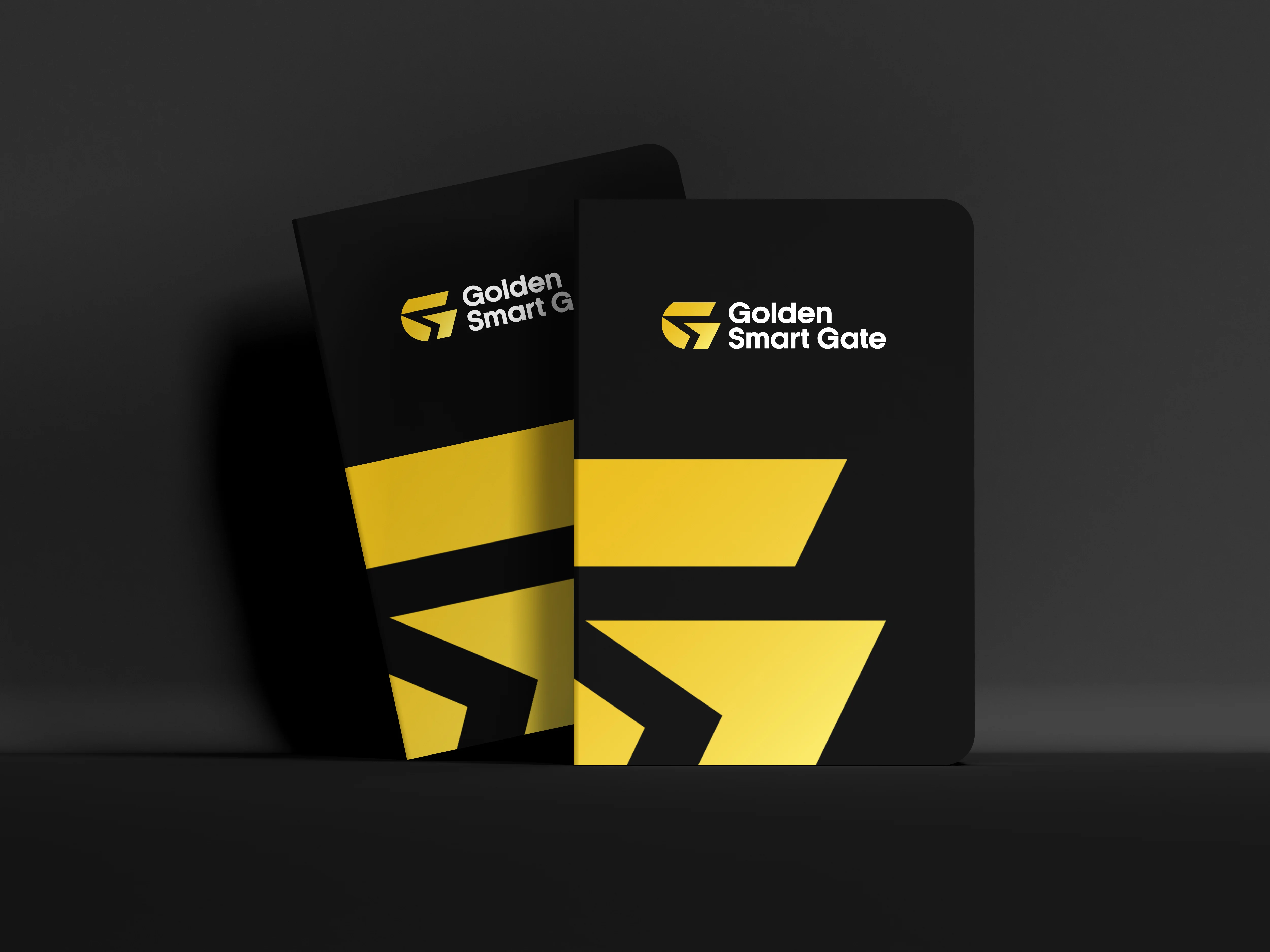
The Golden Smart Gate logo is built around a single guiding idea: a smart path forward. The “G” stands for the brand itself, while the arrow cut into its form represents movement, direction, and progress. It is a visual shorthand for what the company does, which is to open the gate for new businesses and move them through the setup process with ease.
The supporting choices reinforce this sense of confident momentum. The bold, clean typography reads as dependable and clear, much like the service itself. The gold and black palette adds a premium, authoritative finish: gold signals value, success, and ambition, while black grounds the brand with strength and sophistication. The logo also works equally well on dark and light backgrounds, so the identity stays sharp in every application.

The Branhaus Experience
"Branhaus truly understands branding. They listened to our vision and turned it into something even better than we imagined."

"Branhaus helped us re define our brand of TNM Online Solutions! Highly recommended for corporate branding."

"Exceptional creativity backed by a professional approach. Branhaus helped us build a brand identity we're proud to represent."
"What we appreciate most about Branhaus is their commitment to getting every detail right. They consistently deliver thoughtful, high-quality work with a level of professionalism that's hard to find."