Branding & Identity
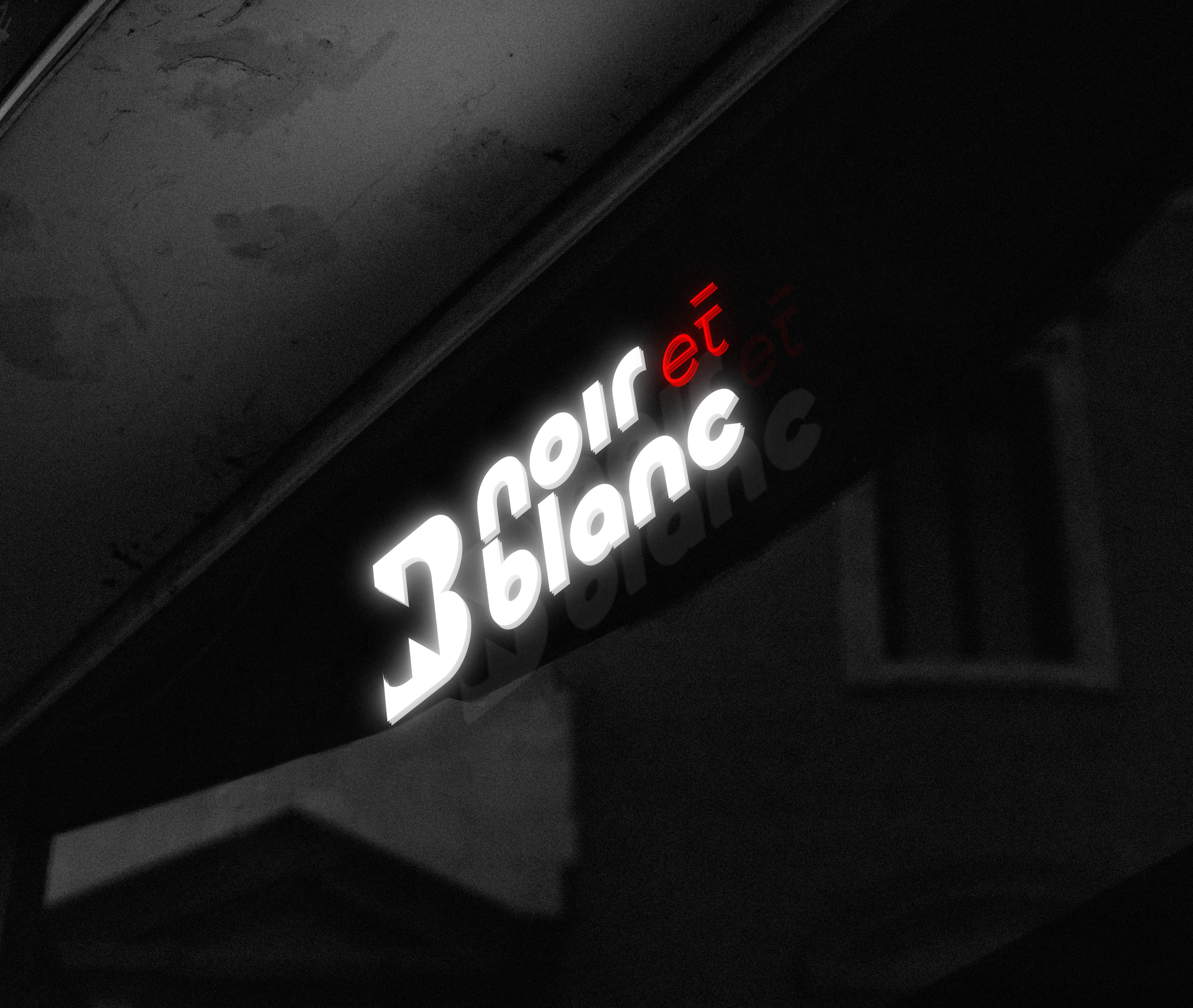
Noir et Blanc is a UAE-based perfume brand inspired by the elegance of contrast—where boldness meets simplicity. The brand blends modern sophistication with timeless appeal, creating fragrances that express individuality and confidence. Each scent is designed to deliver a refined and memorable experience, reflecting a true sense of understated luxury.
Client:
Afra Shad Perfumes Trading Co L.L.C
Scope:
Brand Identity
Industry:
Fragrance & Beauty
Timeline:
4 Weeks
The journey of creating the Noir et Blanc logo began with an in-depth exploration of the brand’s essence—contrast, sophistication, and timeless appeal. We carefully studied the philosophy behind the name, drawing inspiration from the duality of “noir” and “blanc,” which represents harmony through opposites. Initial concepts focused on translating this contrast into a visual identity that feels both modern and iconic. Through sketching and conceptual development, we explored forms that could seamlessly merge boldness with elegance, ensuring the identity resonates with the premium nature of the perfume industry.
As the design progressed, refinement became the key focus. Every detail—from the structure of the typography to the balance between negative and positive space—was meticulously crafted. We aimed to create a logo that not only stands out visually but also communicates a sense of exclusivity and luxury. The final direction was chosen for its ability to maintain clarity across applications while delivering a strong brand presence. This thoughtful process ensured that the identity remains timeless, adaptable, and aligned with Noir et Blanc’s vision.
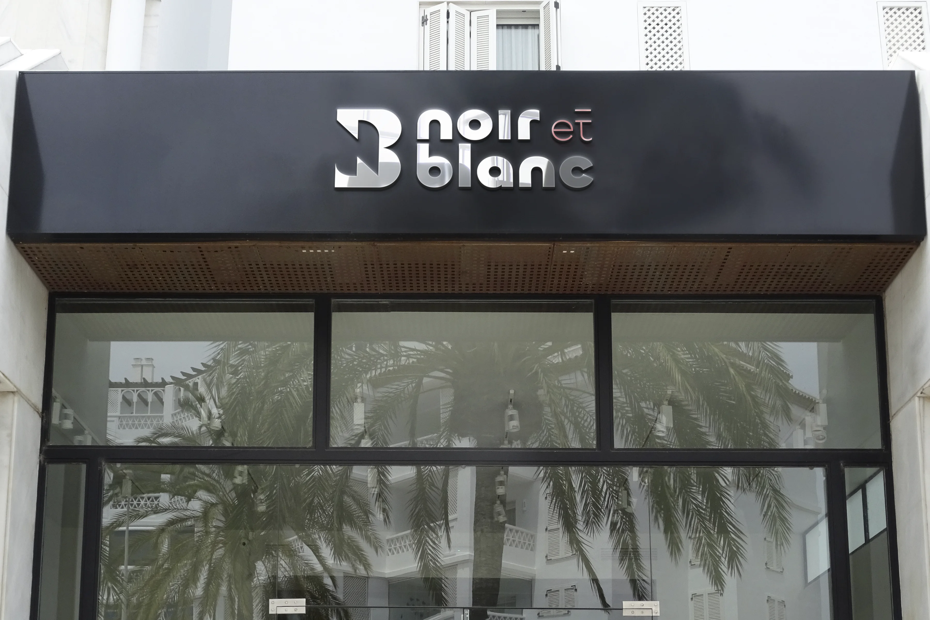
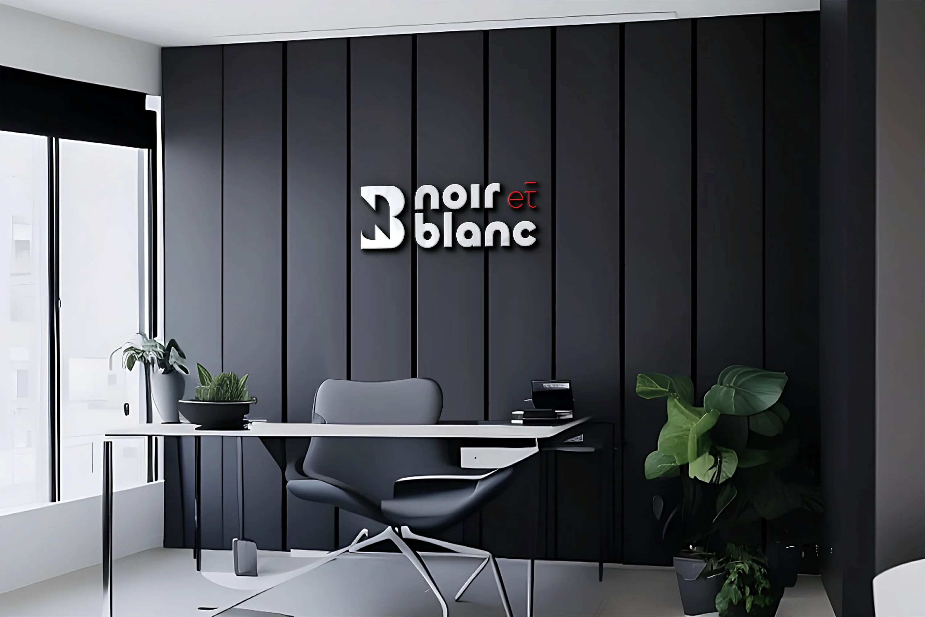
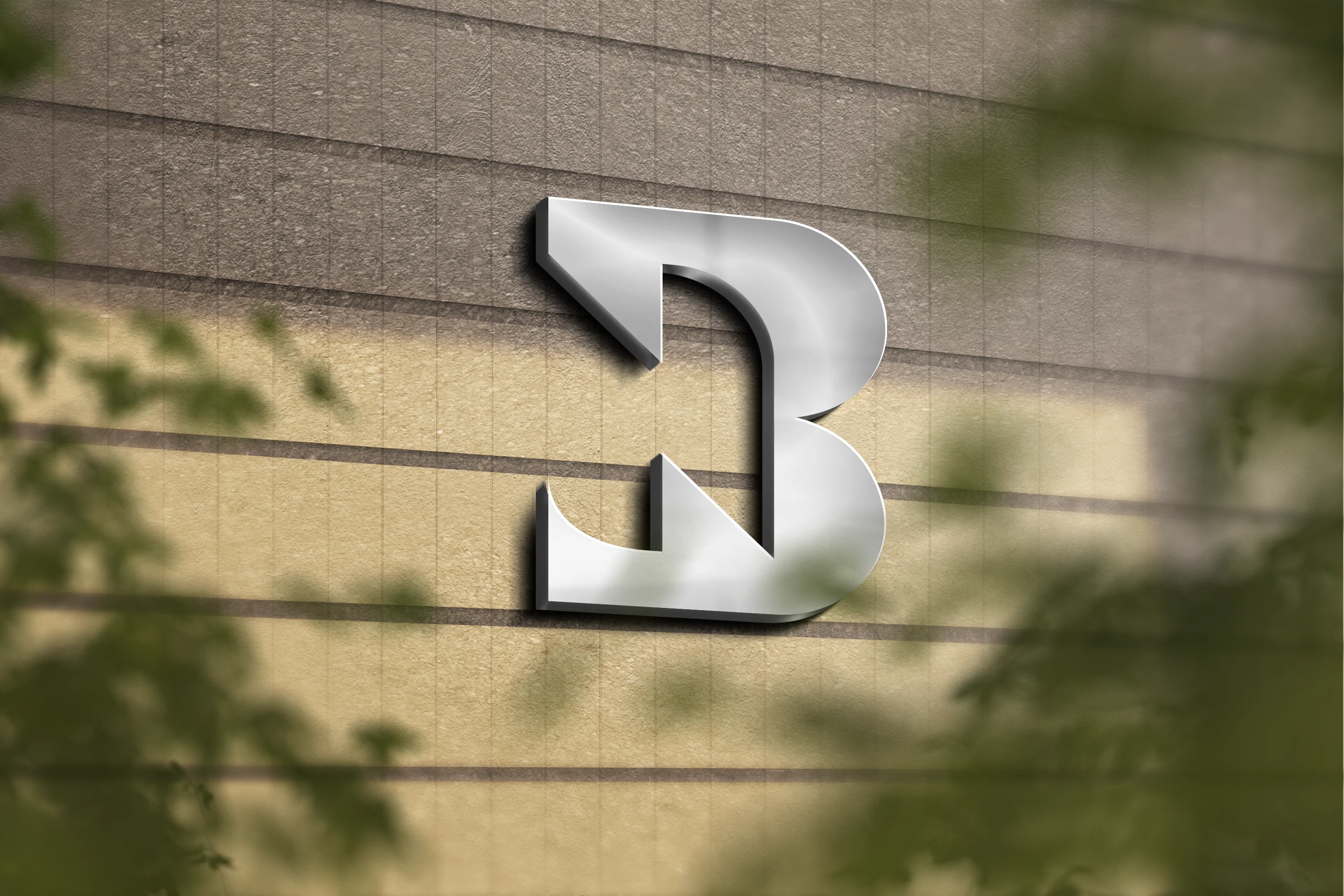
The Noir et Blanc logo is a bold expression of contrast and character. The custom-designed “B” symbol introduces a distinctive visual anchor, giving the brand a unique and memorable identity. The interplay of black and white reflects the essence of the brand name, while the subtle introduction of red in “et” adds a touch of passion and intrigue—creating a visual rhythm that draws attention without overwhelming the composition. The typography is clean yet commanding, reinforcing a sense of confidence and modern luxury.
Beyond its visual appeal, the logo carries a deeper, more human connection. It represents the harmony between opposites—strength and softness, boldness and subtlety—much like the experience of a fine fragrance. The design is intentionally minimal yet expressive, allowing it to feel personal and relatable while maintaining a premium presence. This balance makes the logo not just a symbol, but a reflection of the emotions and stories that Noir et Blanc aims to evoke through every scent.

The Branhaus Experience

"Branhaus truly understands branding. They listened to our vision and turned it into something even better than we imagined."


"Branhaus helped us re define our brand of TNM Online Solutions! Highly recommended for corporate branding."

"Exceptional creativity backed by a professional approach. Branhaus helped us build a brand identity we're proud to represent."

"What we appreciate most about Branhaus is their commitment to getting every detail right. They consistently deliver thoughtful, high-quality work with a level of professionalism that's hard to find."