Branding & Identity
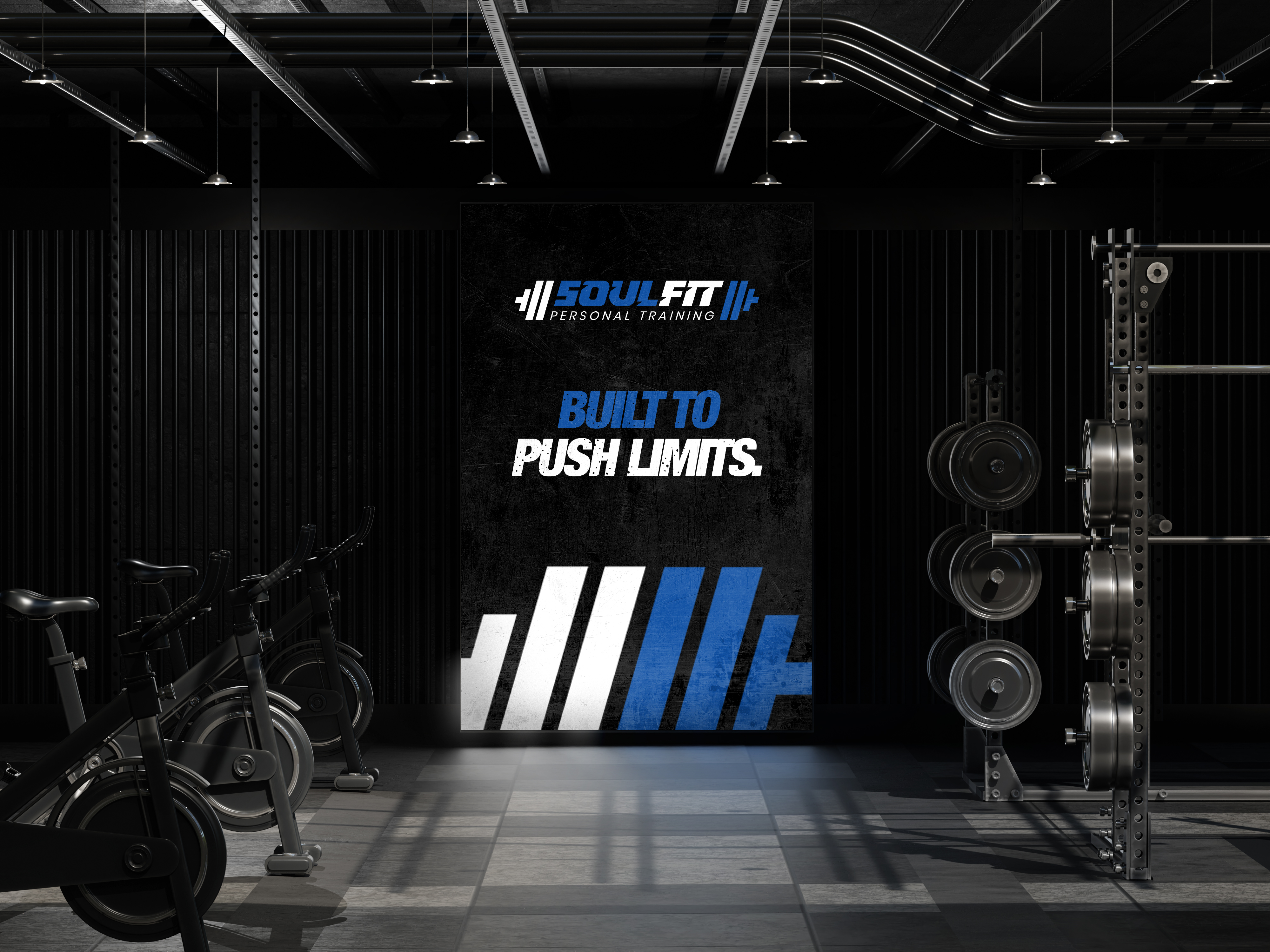
SOULFIT Personal Training is a fitness brand built on discipline, intensity, and results. Its identity channels the energy of training itself — bold, forward-leaning typography paired with sharp dumbbell iconography that commands attention across every application, from apparel to equipment.
Client:
Soulfit Personal Training
Scope:
Branding & Identity
Industry:
Fitness / Personal Training
Timeline:
2 Weeks
Designing the identity for SOULFIT Personal Training started with a simple question: how do you visualize intensity? The brand needed to feel as powerful as the training it represents — built on discipline, drive, and physical transformation. We began by studying the energy of the fitness space itself, looking at how movement, strength, and grit could translate into a visual language rather than just a name on a page.
As the concept developed, we leaned into sharp, forward-slanting letterforms to create a sense of speed and force, as if the wordmark itself was mid-rep. The dumbbell iconography flanking the name wasn't decorative — it was there to root the brand immediately in its world, so the mark reads as "gym" and "grind" at a single glance. Every angle, weight, and contrast choice was pressure-tested against real-world use, from apparel to bottles to signage, ensuring the identity could perform as hard as the clients it serves.
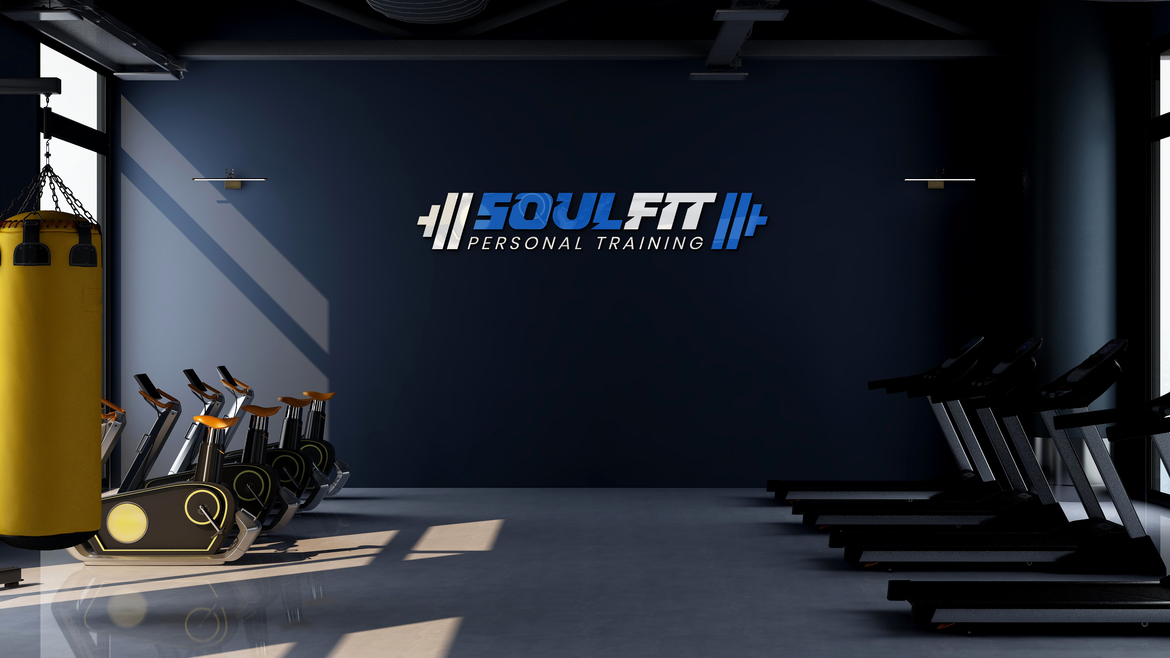
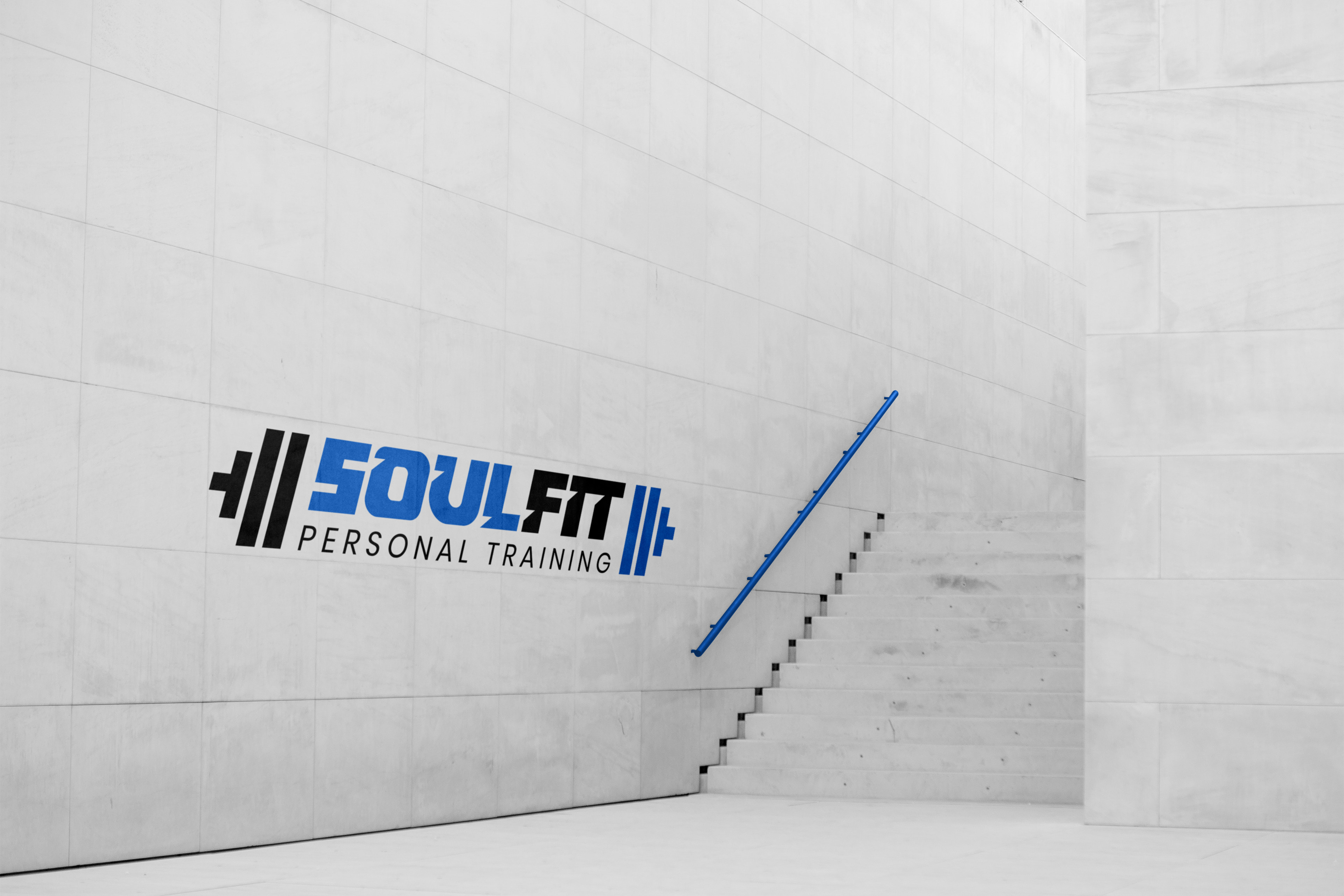
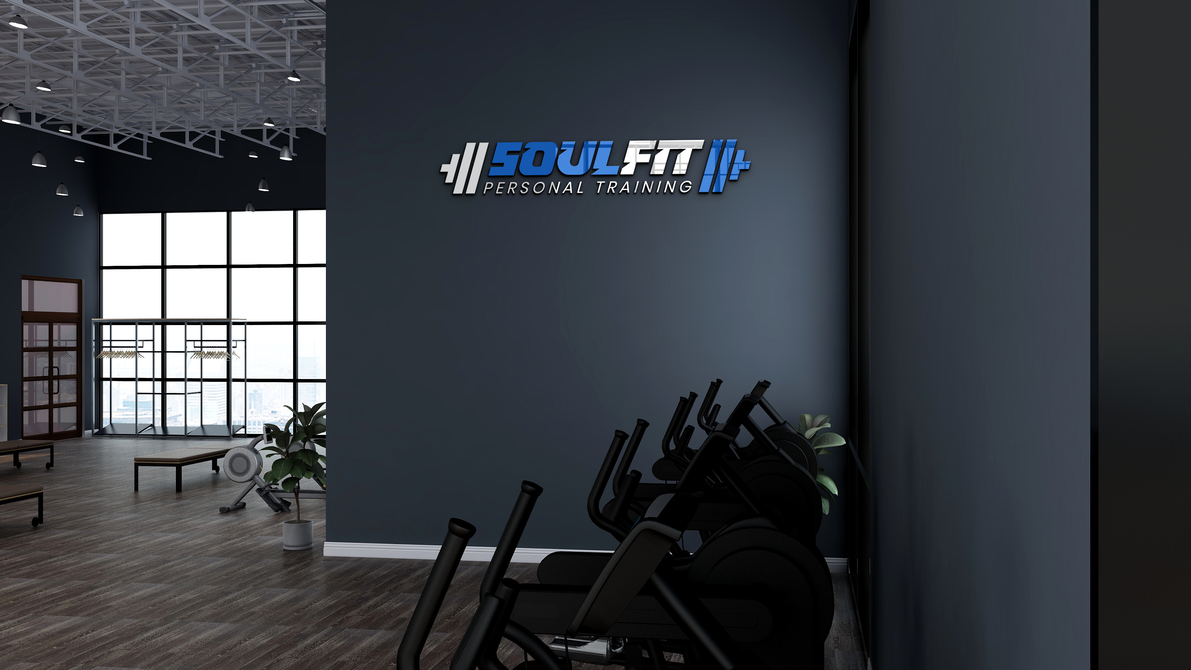
The SOULFIT logo is built for impact. The italicized, high-contrast lettering creates forward motion, echoing the explosiveness of a workout in progress, while the sharp cuts in the letterforms suggest precision and control under pressure. Blue and white were chosen deliberately — blue for focus, trust, and endurance; white for energy and clarity — set against a black backdrop that makes the mark pop in any environment, from a dark gym wall to a matte water bottle.
The dumbbell motif bookending the wordmark reinforces the brand's core identity without needing extra explanation — it's fitness, stated plainly and confidently. "Personal Training" sits beneath in a lighter, more restrained typeface, grounding the aggressive main mark with a note of professionalism and trust. Together, the system strikes a balance between raw intensity and credible expertise — exactly the tone a personal trainer needs to build both motivation and confidence with clients.

The Branhaus Experience

"Branhaus truly understands branding. They listened to our vision and turned it into something even better than we imagined."


"Branhaus helped us re define our brand of TNM Online Solutions! Highly recommended for corporate branding."

"Exceptional creativity backed by a professional approach. Branhaus helped us build a brand identity we're proud to represent."

"What we appreciate most about Branhaus is their commitment to getting every detail right. They consistently deliver thoughtful, high-quality work with a level of professionalism that's hard to find."