Branding & Identity
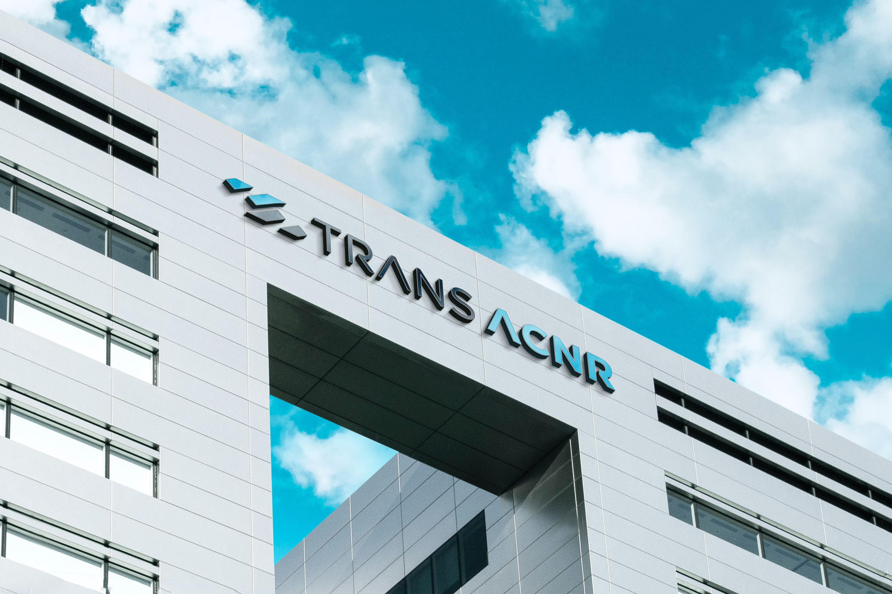
Trans ACNR is a global leader in transport air-conditioning and refrigeration, established in 2003 to deliver reliable climate-control systems for buses and transport vehicles worldwide. Its identity reflects the brand's engineering precision — a clean, directional mark paired with confident, industrial typography built to perform across every application.
Client:
Trans ACNR Solutions Pvt. Ltd.
Scope:
Branding & Identity
Industry:
Transport / Air-Conditioning & Refrigeration
Timeline:
2 Weeks
Designing the identity for Trans ACNR meant capturing over two decades of engineering precision in a single, unmistakable mark. Established in 2003, the company built its reputation on a clear mission — delivering top-tier air-conditioning and refrigeration systems for buses and transport vehicles worldwide. We began by studying that mission at its core: comfort, reliability, and performance under constantly shifting conditions. Every design decision needed to reflect the same rigor the company applies to its engineering.
As the concept evolved, we focused on translating motion and airflow into visual form. The result is a mark defined by clean, angular geometry that suggests directional movement — a subtle nod to both the transport industry Trans ACNR serves and the flow of air central to its technology. Paired with a bold, structured wordmark, the identity communicates precision without complexity, giving the brand a global, industrial confidence that holds up on everything from vehicle branding to corporate signage.
The Trans ACNR logo is built around a single guiding principle: clarity in motion. The angular symbol preceding the wordmark represents the dynamic flow of air — a visual shorthand for the climate-control technology at the heart of the company's work. Its faceted, three-dimensional form suggests both engineering precision and forward momentum, reflecting a brand in constant motion across markets and vehicles worldwide.
The typography reinforces this same sense of technical confidence — solid, geometric letterforms that read as dependable and exacting, much like the systems the company builds. The cool blue-grey palette reflects the brand's core function: temperature, air, and climate control, while retaining a professional, corporate finish suited to industrial and B2B audiences. Together, the mark and wordmark form an identity that feels engineered rather than decorated — precise, efficient, and built to perform in every condition, just like the products it represents.

The Branhaus Experience
"Branhaus truly understands branding. They listened to our vision and turned it into something even better than we imagined."


"Branhaus helped us re define our brand of TNM Online Solutions! Highly recommended for corporate branding."

"Exceptional creativity backed by a professional approach. Branhaus helped us build a brand identity we're proud to represent."

"What we appreciate most about Branhaus is their commitment to getting every detail right. They consistently deliver thoughtful, high-quality work with a level of professionalism that's hard to find."