Branding

Yezthing Marketing is a forward-thinking creative agency focused on delivering impactful digital marketing solutions for modern businesses. With a strong emphasis on strategy, creativity, and measurable results, the brand positions itself as a partner for growth—helping companies build meaningful digital presence, strengthen brand identity, and connect with their audience in a constantly evolving digital landscape.
Client:
Yezthing Marketing
Scope:
Branding Identity
Industry:
Digital
Timeline:
2 Weeks
Designing the identity for Yezthing Marketing was a journey rooted in understanding both the vision of the brand and the dynamics of the digital marketing industry. We began by analyzing the core values—innovation, clarity, and performance—and translating these into visual language. Extensive research into industry trends and competitor positioning allowed us to identify opportunities for differentiation. Sketch explorations and concept iterations were developed to capture a sense of motion, growth, and strategic direction, which are essential traits of a modern marketing agency.
As the concept evolved, we focused on refining a mark that would be both minimal and memorable. The goal was to create a symbol that works seamlessly across digital platforms while maintaining strong brand recall. Every element—from proportions to spacing—was carefully considered to ensure scalability and versatility. The final outcome reflects a balance between creative expression and functional design, aligning perfectly with Yezthing’s role as a results-driven digital partner.
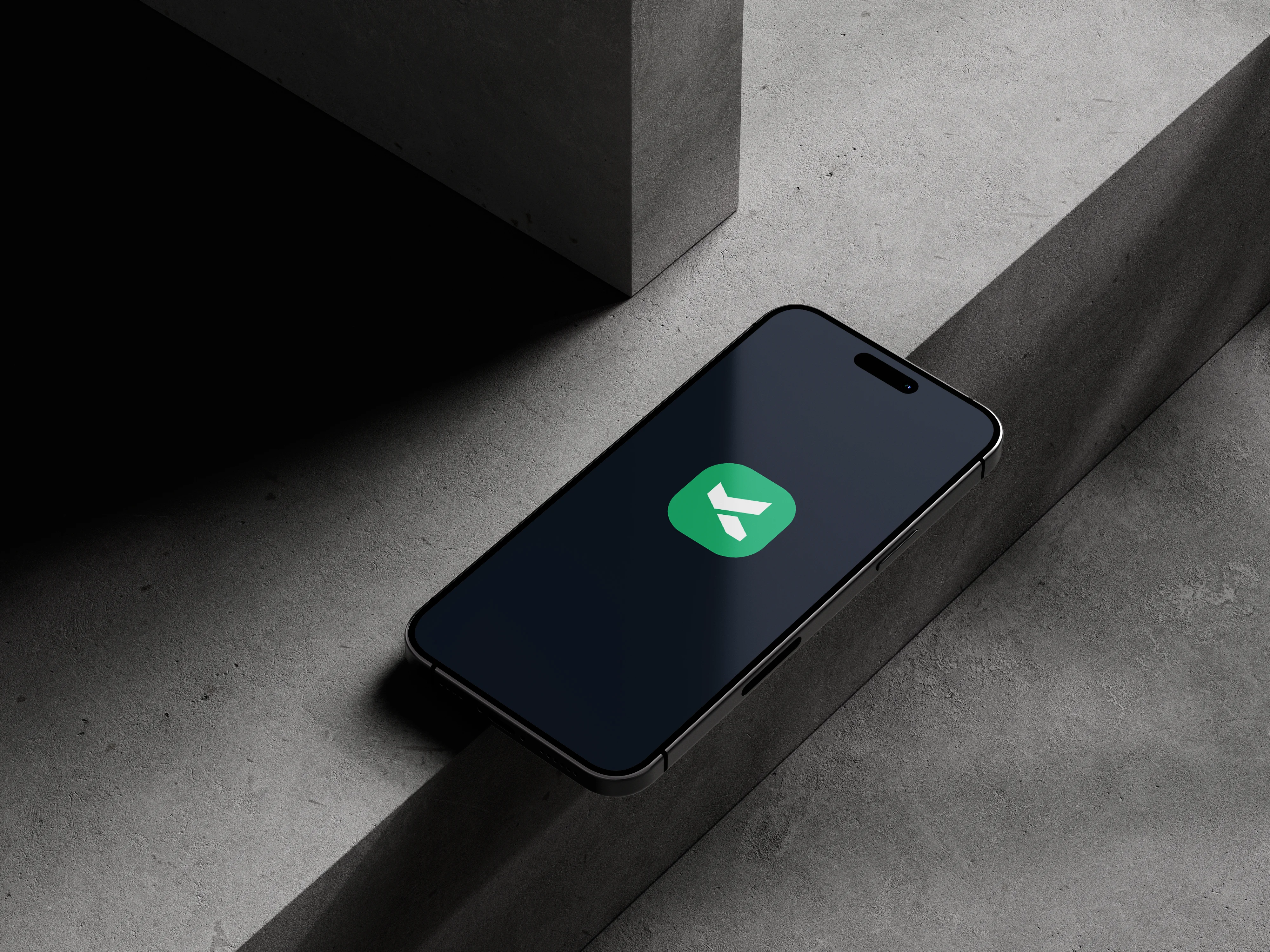
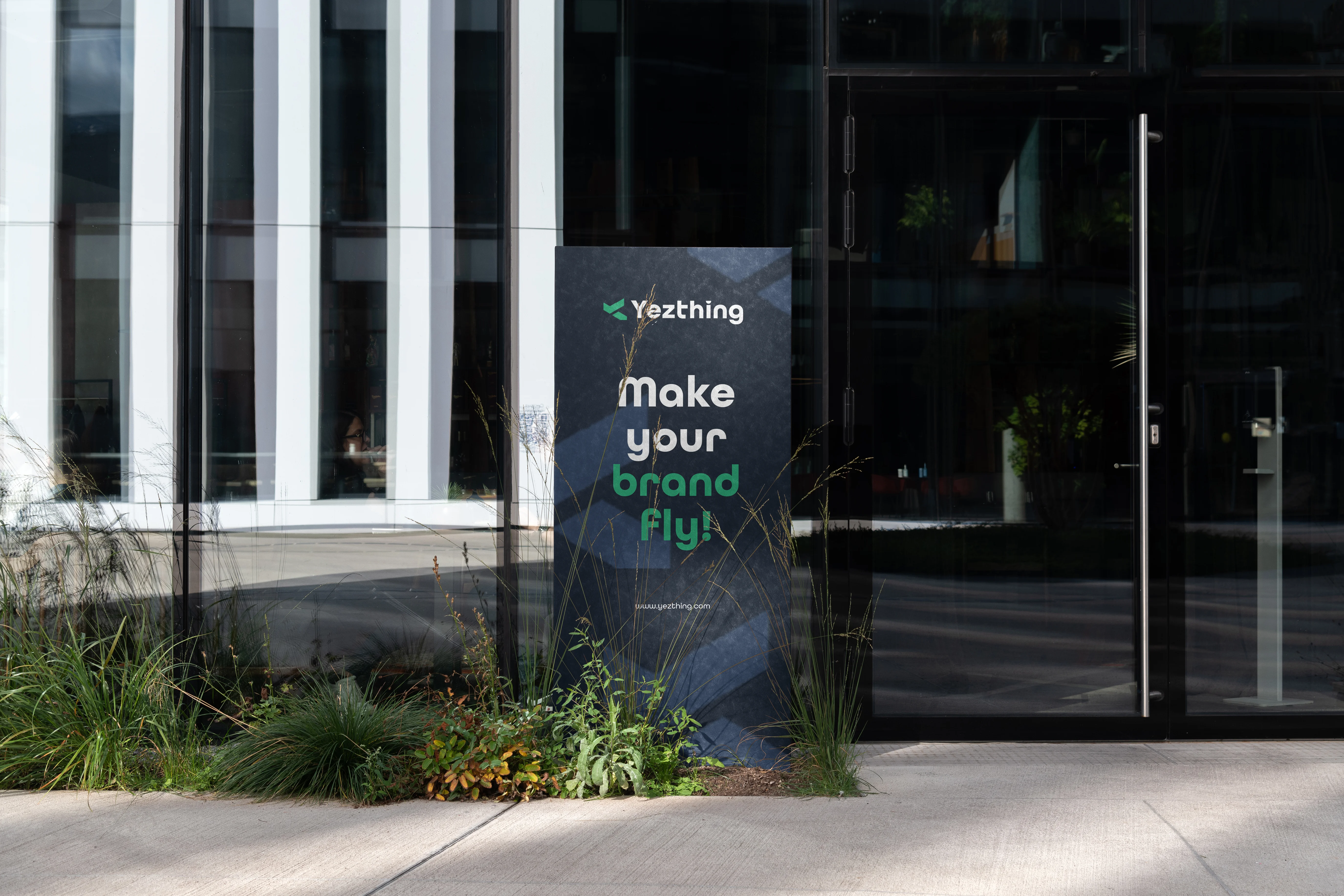
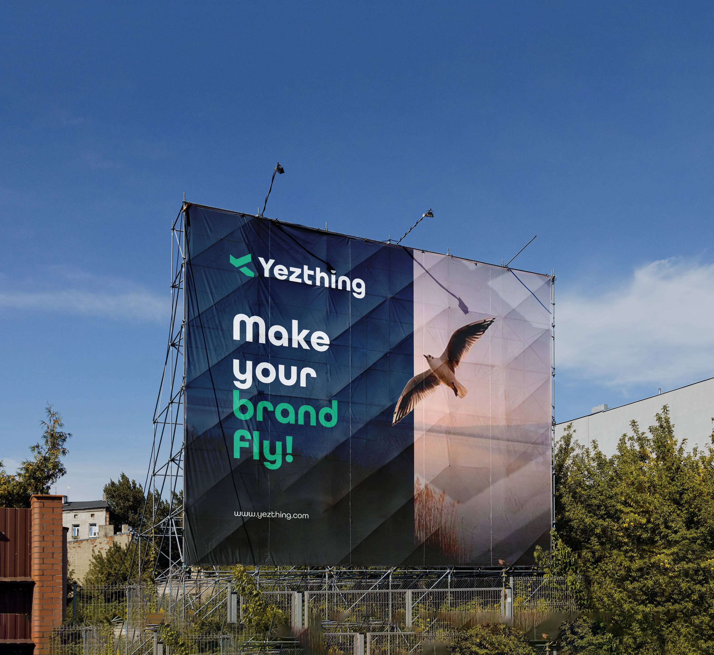
The Yezthing logo is a clean and contemporary representation of a brand built on precision and progress. The symbol is designed with sharp, geometric forms that suggest direction, movement, and forward momentum—key attributes in the fast-paced world of digital marketing. The use of green tones reflects growth, innovation, and trust, while the bold typography reinforces confidence and clarity in communication. Together, the icon and wordmark create a cohesive identity that is both professional and approachable.
Beyond aesthetics, the logo carries a human touch that resonates with the brand’s purpose. It is not just a visual mark, but a representation of how Yezthing connects ideas with execution. The simplicity ensures instant recognition, while the structured form conveys reliability and expertise. This balance allows the brand to stand out in a crowded digital space while remaining relatable to the businesses it serves, making the logo a true reflection of Yezthing’s vision and personality.
The Branhaus Experience

“Branhaus helped us re define our brand of TNM Online Solutions! Highly recommended for corporate branding.”

“Branhaus truly understands branding. They listened to our vision and turned it into something even better than we imagined.”

“Working with Neuage was a game-changer. Their team understood our vision from day one and delivered designs that elevated our brand’s presence.”